
Gleam Energy
Role Founder • Product Design • UX Research • Frontend Development • AI • Product Strategy
Years 2023–PRESENT
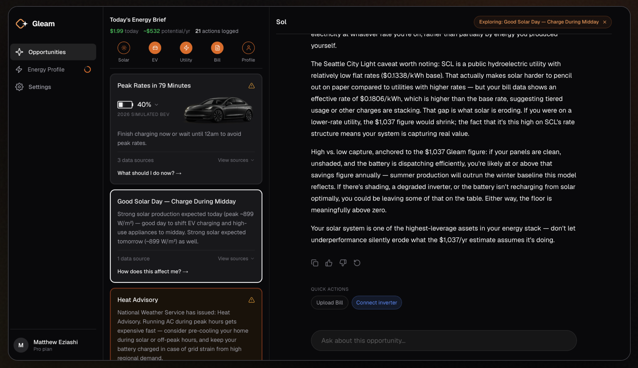
I transformed fragmented energy data into clear, personalized opportunities, helping homeowners make smarter decisions that reduce their energy costs.
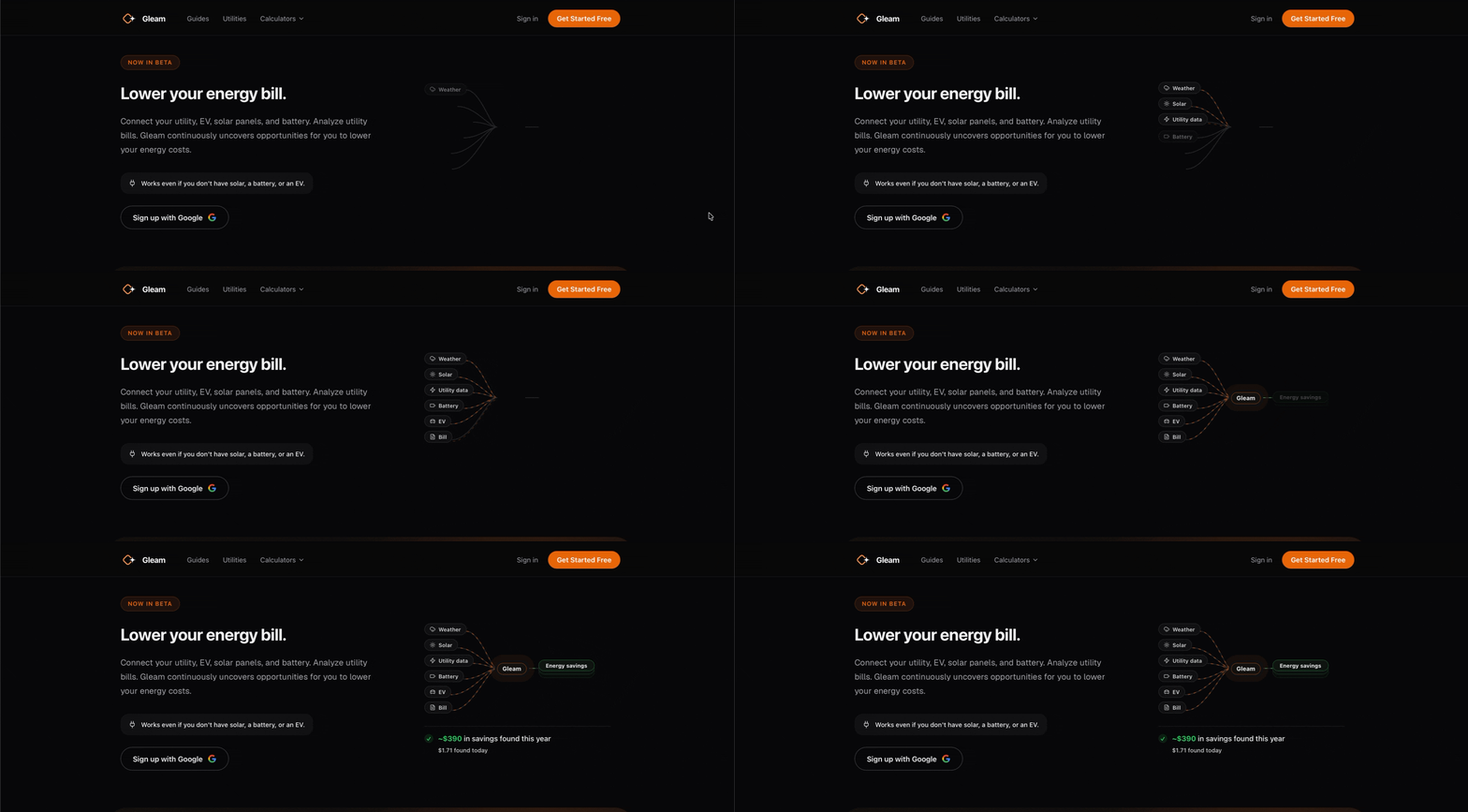
PROBLEM
Installing solar panels, buying an EV, or investing in a battery doesn't automatically lower your energy bill. Most homeowners don't know whether they're on the right electricity plan, charging at the right time, or taking advantage of available savings. Existing tools show data—but rarely tell people what to do next.
There’s tons of data people aren’t seeing, or aren’t able to act on.
OPPORTUNITY
More than 5 million U.S. homes have rooftop solar, and EV adoption continues to accelerate. Yet homeowners still piece together information across utility websites, inverter apps, charging apps, and spreadsheets.
I saw an opportunity to build a single product that answered one question:
"Given everything I know about your home, what's the smartest thing you should do next?"
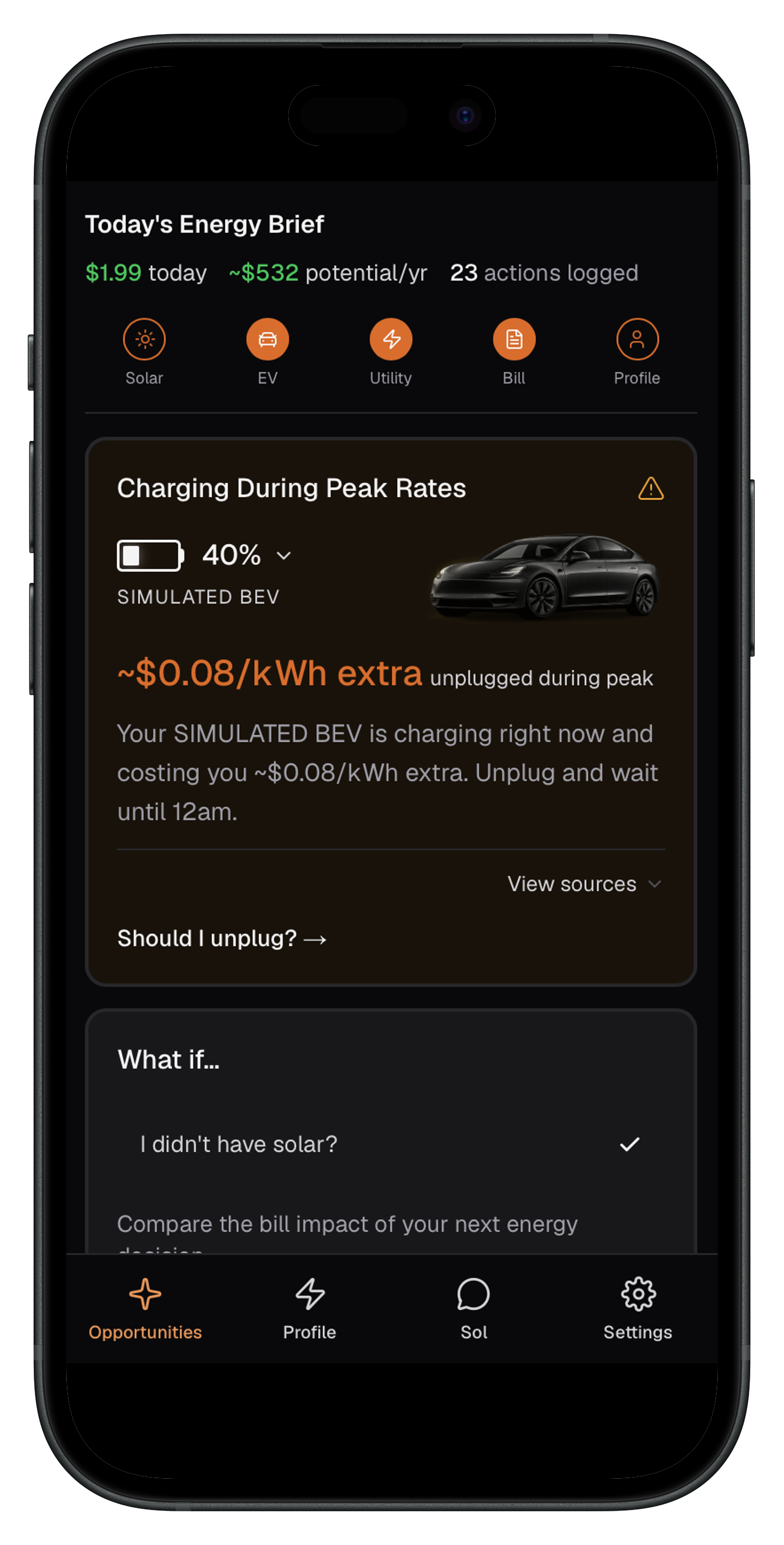
My Role as a Founder
Over the course of the project I:
Defined product strategy
Conducted dozens of customer interviews
Designed every user experience
Built the frontend in Next.js
Integrated AI workflows
Created the marketing website
Built SEO landing pages
Launched calculators to drive organic traffic
Shipped the mobile app
Iterated continuously based on user feedback
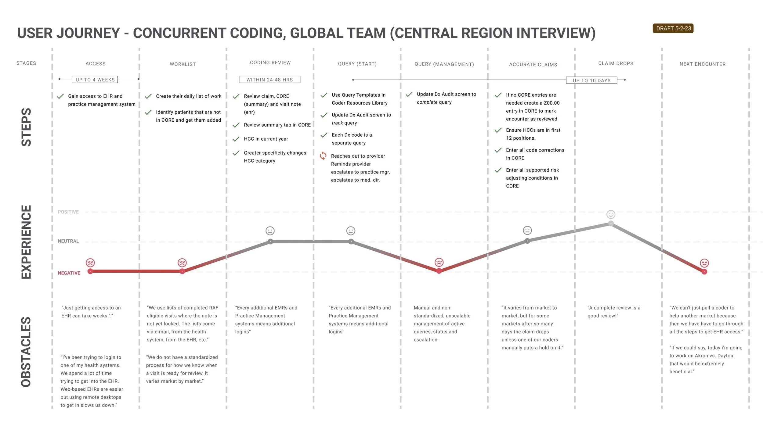
Our Coders workflow.
Ok. What are the parts of the Coders journey I can impact?
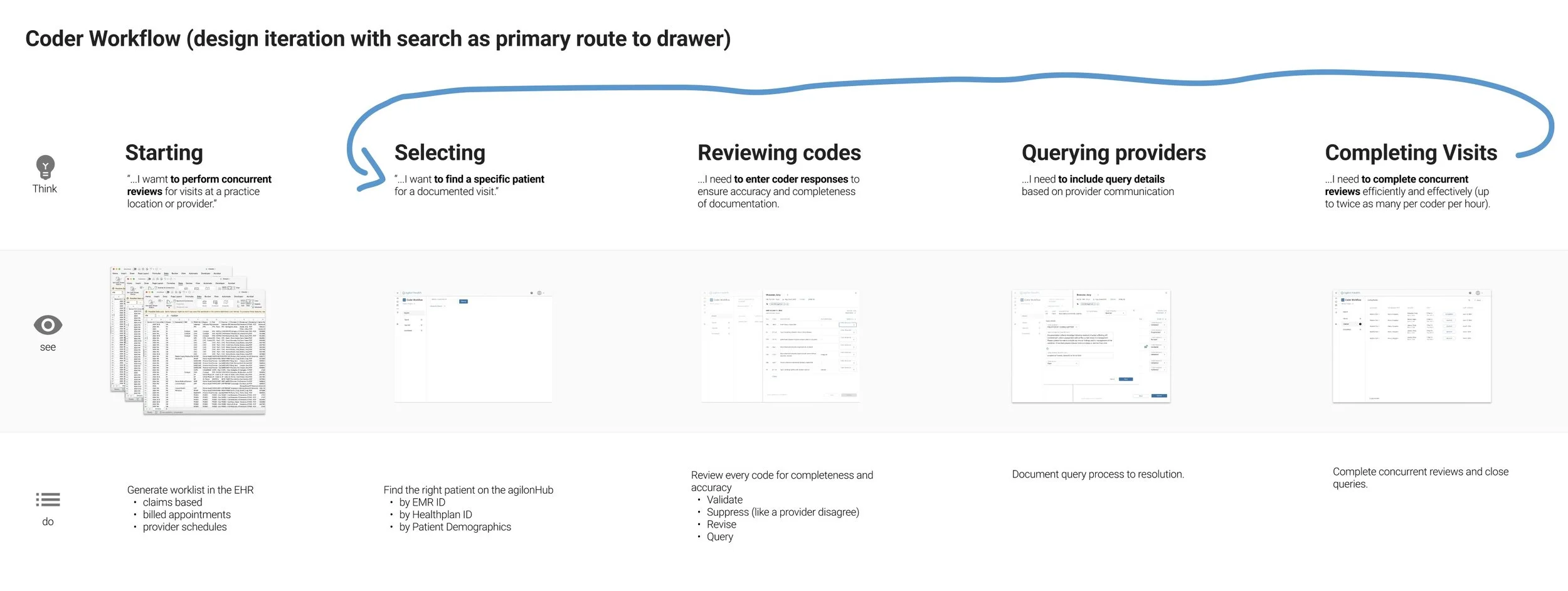
With team consensus, I focused on:
Selecting Codes, Reviewing Codes, Querying providers, and Completing a review.
Once I was able to grasp the entire process, I documented it in a journey map. I assisted our PM to help compile documentation on Confluence.
IDEATION
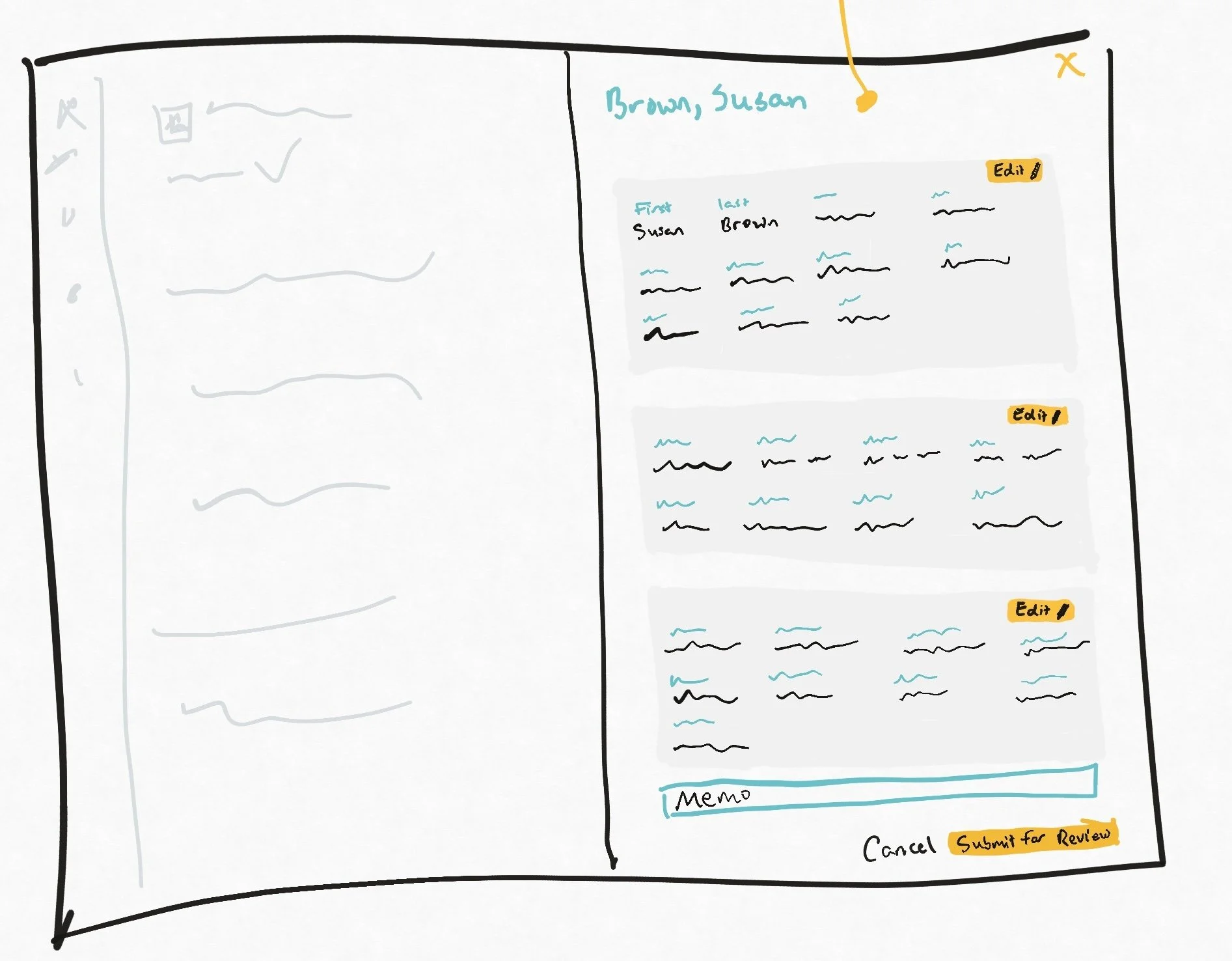
I ideated on a few concepts. I presented them to the team for feedback, and cycled through that process from there. Figma was my bread and butter.
Concept Narrowing
The concept started to take shape as I realized a few key things:
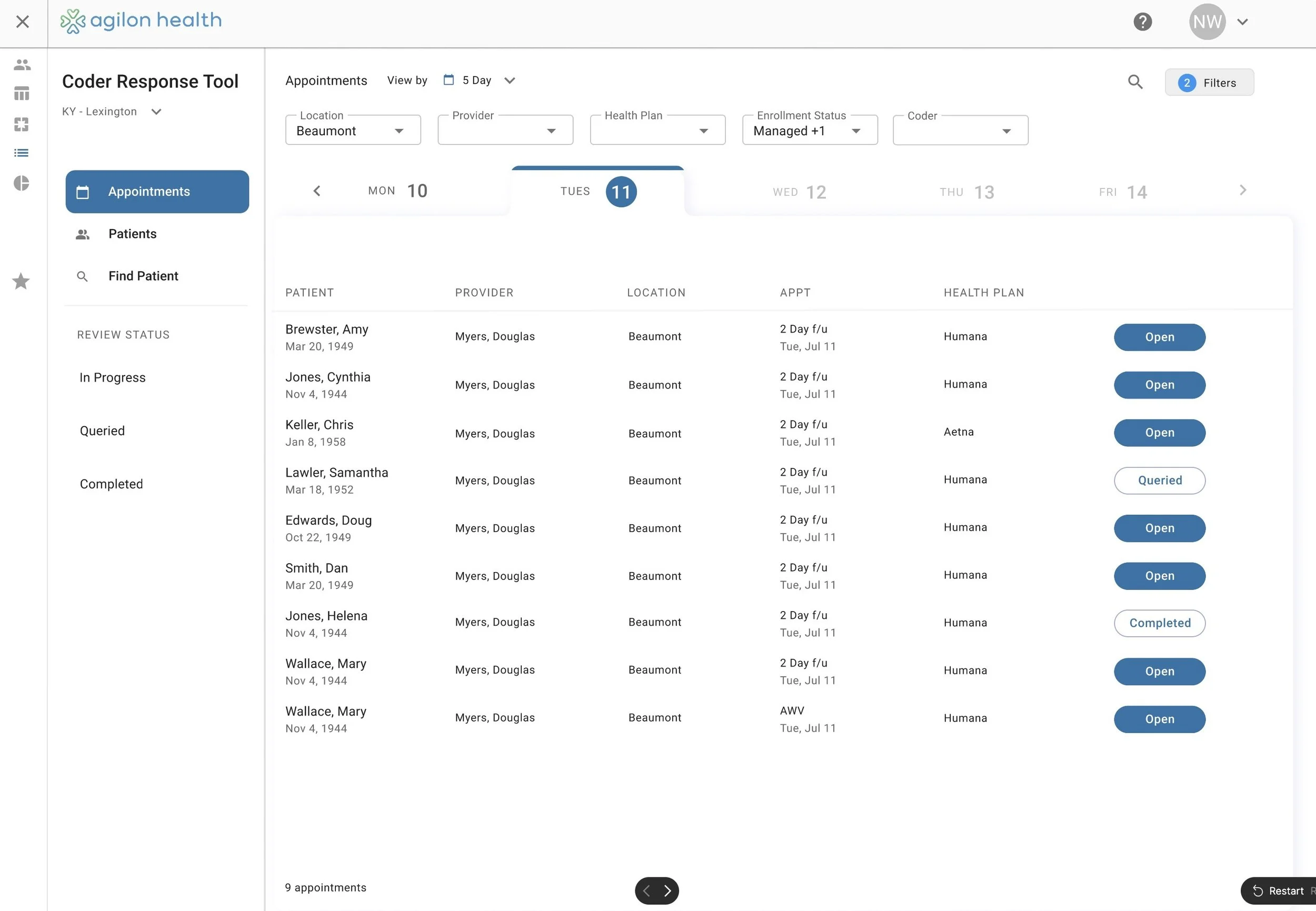
Seeing a list of patients with recently completed appointments matched our Coders mental model.
“I want to Code patients that were recently seen by doctors.”
Users need to be able to search for and select individual patients.
“I need to find a specific patient.”
Coders being able to see a Practice’s patient roster saves a lot of time.
Based on these strong findings from interviewing Coders and understanding their workflow, I knew Coders needed to view patients by recent Appointment, full Practice Patient List, and by Searching.
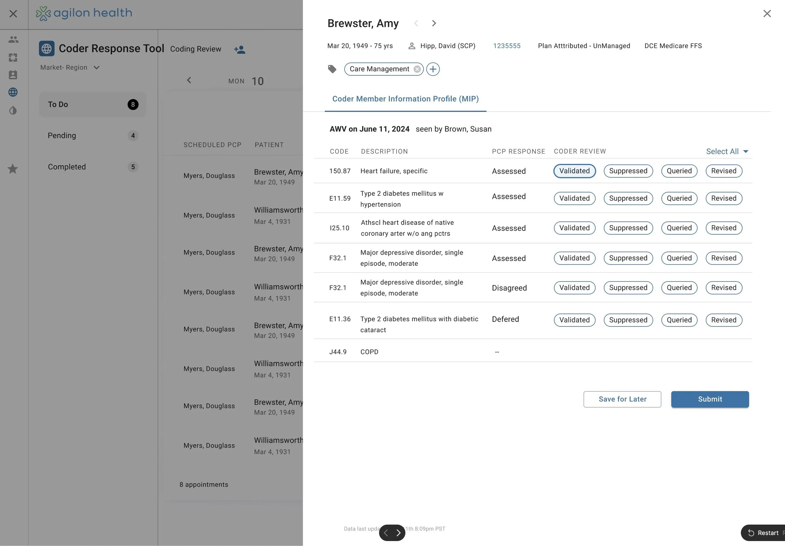
Coders prefer seeing the full ICD 10 code, and its metadata RATHER than being able to see all the options they can take on that code.
Coders need to be able to save a review, and come back later.
There are different “types” of Coder reviews, which need to be changed at will.
These nuggets of info we learned through constant feedback sessions helped me select and enhance the Figma prototype.
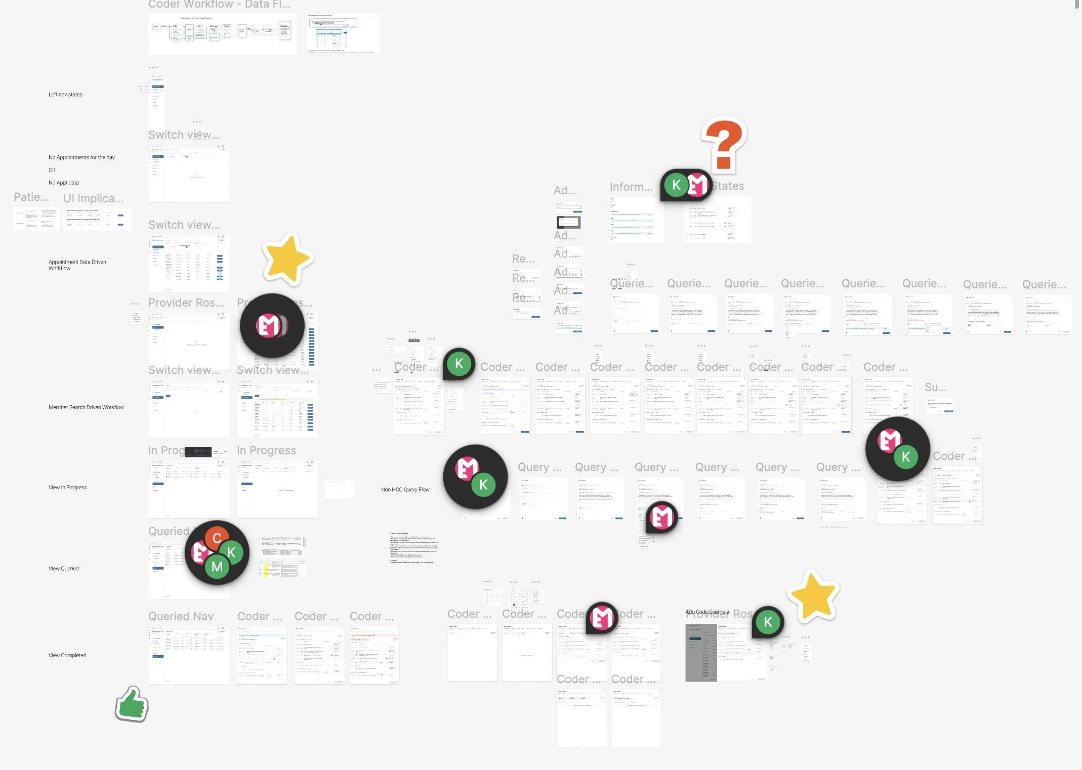
DESIGNS
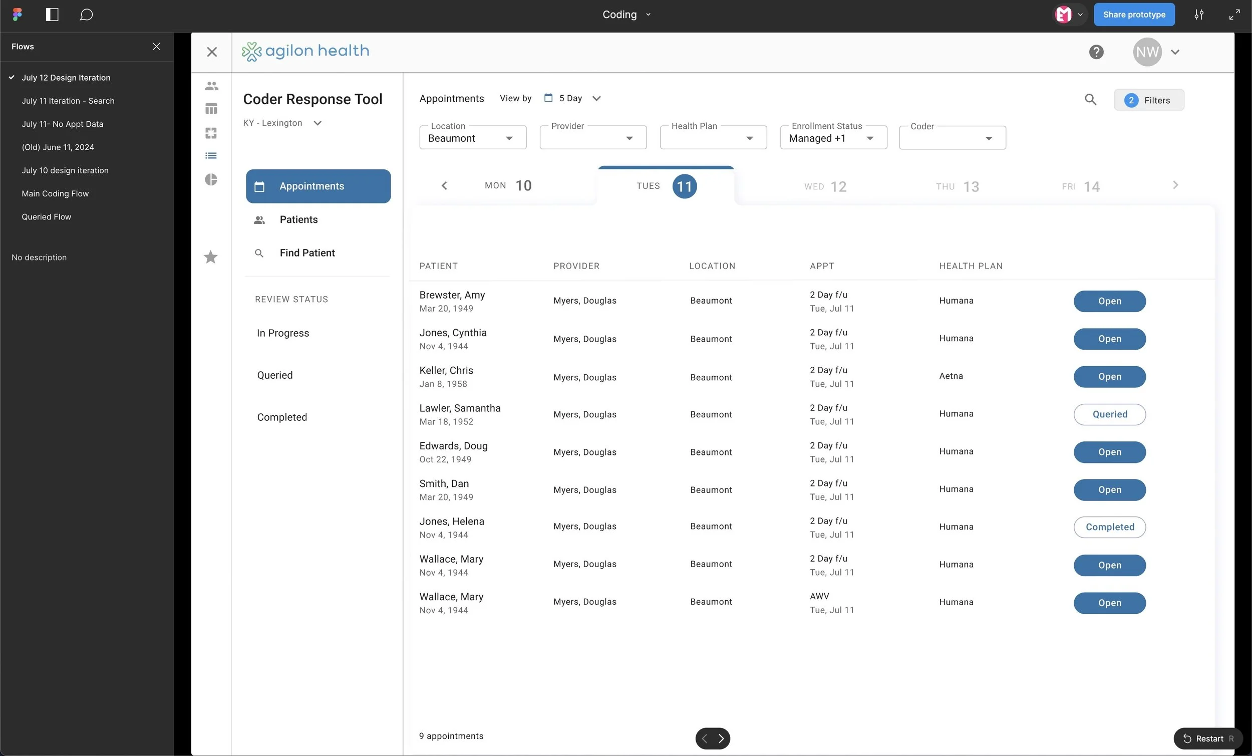
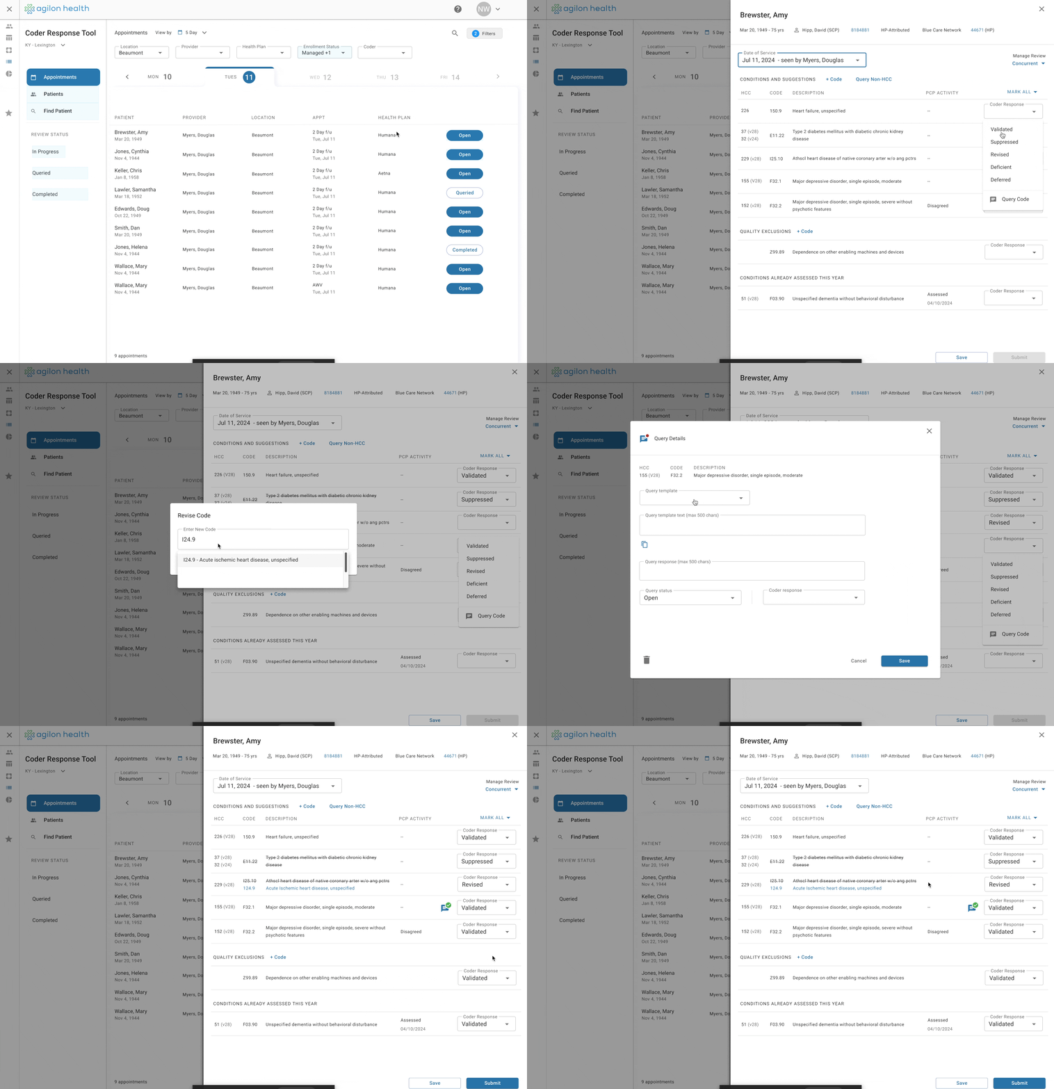
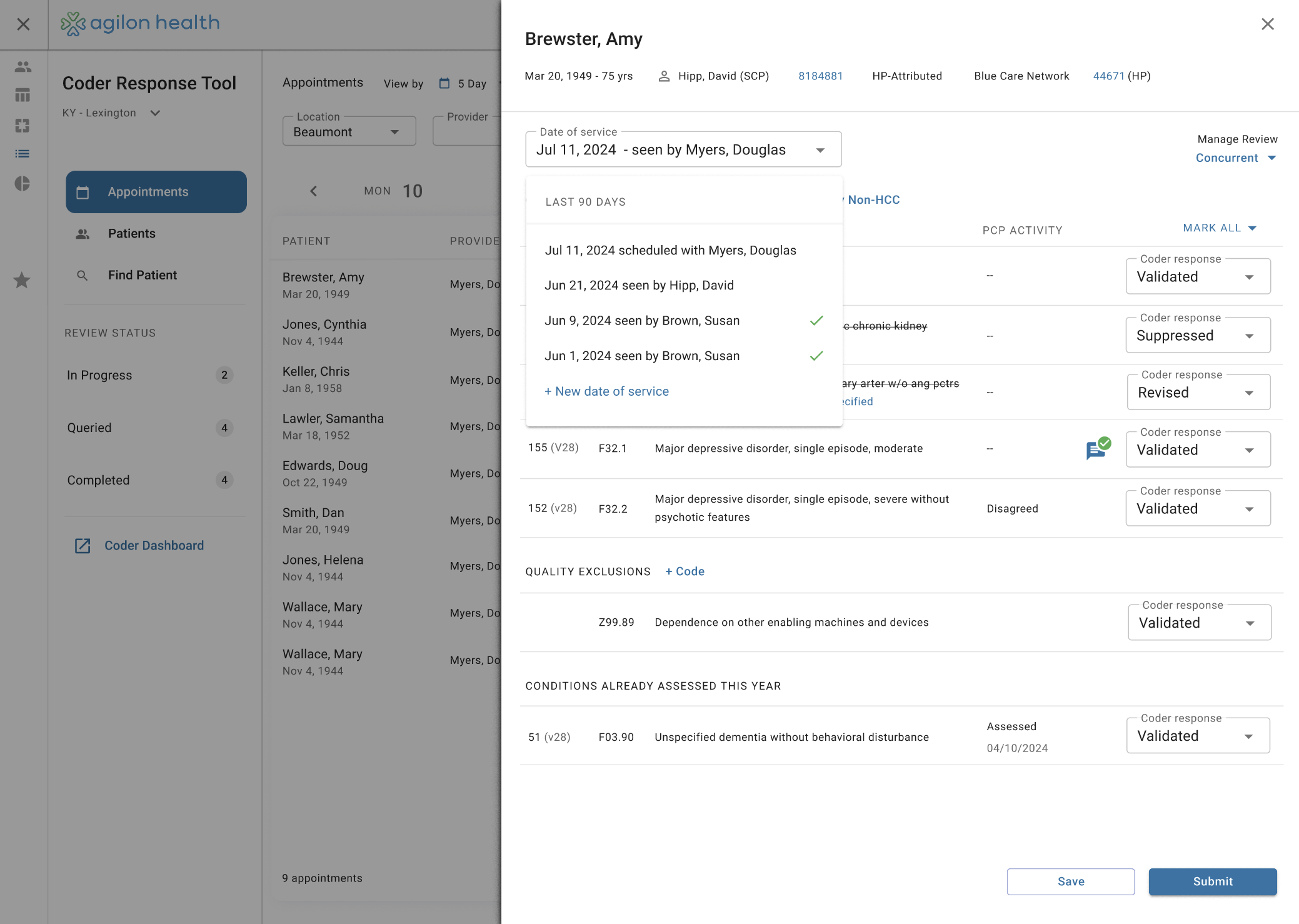
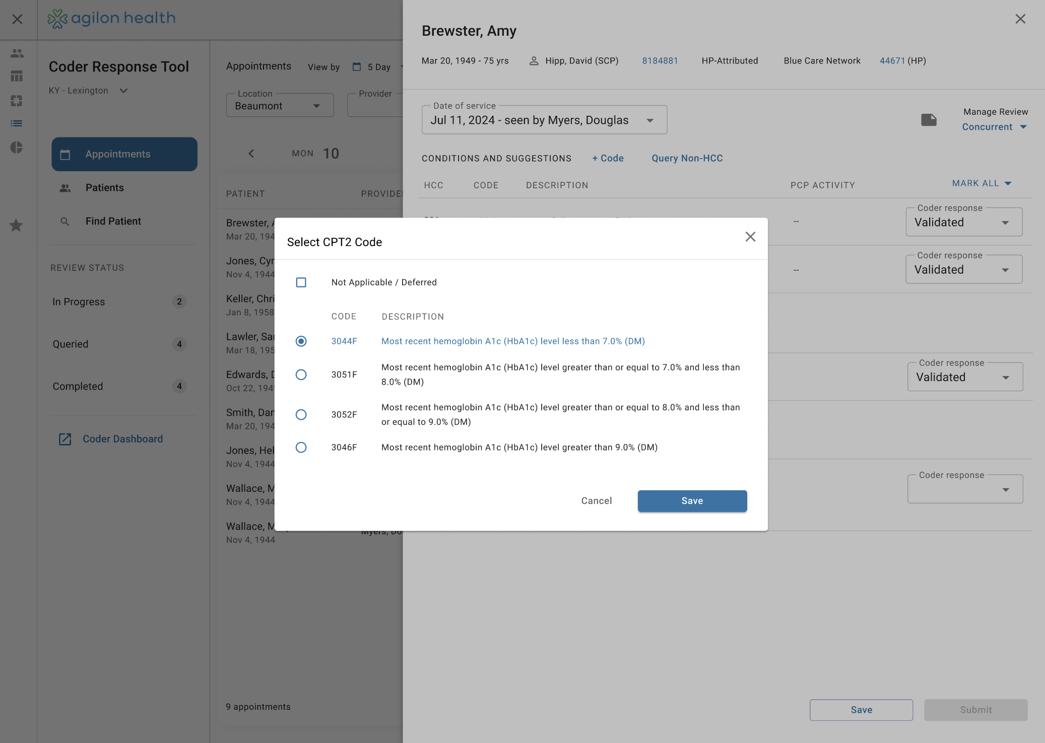
I continuously iterated on the prototype with input from users, stakeholders, and engineering, using it as the foundation for development.
During implementation, I partnered with Amy (Lead Coder) to review builds, gather feedback, and translate findings into actionable updates—working closely with engineers to refine data handling and resolve UI inconsistencies.
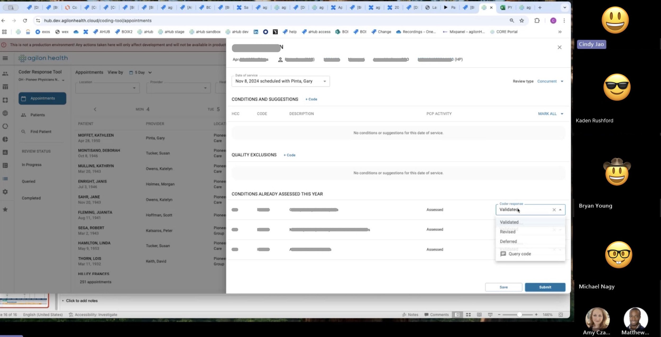
Design ←→ Build
The project followed a continuous design–development loop rather than a linear handoff. Engineers implemented approved portions of the prototype, while I continued iterating on areas that required deeper validation with stakeholders and Amy (Lead Coder).
Each iteration fed back into the process: once designs were validated, I created Jira tickets and worked directly with engineers to guide implementation, refine edge cases, and ensure alignment between UX, data, and technical constraints.
After refinement.
Testing
What Changed?
Coders increased their coding output.
More accurate Codes for patients resulted in less billing mistakes, and less back-and-forths with practices we partner with.
Cleaner data for Agilon Health, our “risk adjustment” model was more seamless.
A more modern, updated system lowered input errors.
Mass adoption upon launch of the new coding system.
Learnings + Summary
This project was very data-heavy, even though the workflow was fairly straightforward. Select a patient —> validate codes —> rinse and repeat.
I understood how complex the process of validating a patients conditions can be. Its heavily dependent on when they come in to the doctor, and the moment of care.
Coders are essential people in the medical field, their accuracy determines how a practice sees a patient before they come in. Making their job easier makes Agilon’s risk adjustment model better.
Our design approach of working with developers on the implementation, versus spending hours creating pixel-perfect designs was the correct method. We used Material Design as a foundation. Leveraging this, it was farily easy to have 1-on-1 sessions with developers when they had questions or problems implementing a design. We’d also have ad-hoc QA sessions with dev where we’d make changes to the front end live.
Good PM’s make life so much easier, when designers inevitably have the question of: “What data should go here?”
When Product, Design, and Engineering work together to drive the design forward from their unique angles, the design gets validated the fastest.
Confluence was used to document the requirements, and JIRA to create all tickets necessary for development.
The JIRA stories requiring design were tagged “needs-ux”. I made sure these tickets had appropriate design links, screenshots, or prototype links necessary for developers to understand the interactions.